A Stroke of Genius: The Art of Paul Mann

PAUL MANN is an accomplished artist having nearly 40 years of experience in painting and drawing, whose work draws inspiration from the premier artists of the '50s and '60s. His use of oils, acrylics and gouache separates him from the traditional digital artists of the modern era, giving him a unique style and composition that is unmatched in the Alternative Movie Poster community. We sat down with him to talk about his portfolio on James Bond, which is one of his most influential properties and includes some of his best work.
For most artists we speak to, they're moving towards embracing digital tools when creating their art, however you tend to still use traditional methods of oils, gouache, and acrylic. Why do you still embrace these methods? What is it you like about them?
I'm an old-school guy, I grew up seeing that kind of art. When I was a kid, there were these wonderful illustrations in all the magazines, and on the cover of Time magazine and TV Guide. You'd pick up a Sports Illustrated, and they would hire the most famous illustrators at the time to do artwork. I grew up with that look and I loved it. Having such a huge interest in art, that was just the look that seemed to connect with me. I never had any interest in doing digital or anything like that, I just wanted to do what felt right to me. It’s only taken me 45 years to get there [laughs]. I put a lot into learning this style, and it took a lifetime to learn. There is something wonderful about holding a brush in your hand with paint on it and touching it to a surface and being able to create wonderful images. I don't want to put that on the shelf to do something else; and it makes my work unique. Don’t get me wrong, a lot of digital work is absolutely wonderful. But what I do is different, it feels right and works for me.

Image Credit: Paul Mann
You have mentioned this style gives you the control you want. Can you explain that?
Over the years doing hundreds upon hundreds of assignments and illustrations, I’ve been able to figure out a process that works for me. I'm able to weed out any problems when putting this work together. Probably about 20 - 25 years ago, I had to do some religious work where I needed to do 250 Bible illustrations in two and a half years. I said, “Man, I've got to have a process down that works every time and fast.” So I did this acrylic-wash-type technique, and it worked. I was able to do that huge body of work quickly.
Before being encapsulated into the Alternate Movie Poster (AMP) world, what were you doing? How did your career shift to pop culture and movie posters?
I've done artwork since I was a kid, and I recall doing my first illustrations when I was in high school for a clothing shop that had billboards on the side of the road; I did a handsome guy in a suit. Living in Utah near Salt Lake City, where the headquarters of the Latter Day Saints (LDS) church is, they have several magazines that they would print, and I would do a ton of work for them. It might be Bible stories, pioneer stories of them settling and colonizing the West, or it might be just everyday stories of promoting faith. I also did work for the Southern Baptist Church doing Bible paintings. Those were great assignments to learn how to illustrate, since it’s all figure work and figures interacting with each other, as well as creating compositions where there are scenes containing backgrounds, middle grounds, and foregrounds. Doing that type of work for 40 - 45 years taught me a lot on how to make illustrations. About seven years ago, those jobs began to slow down, and for a while, I was doing gallery work and Western gallery paintings; American Indians, cowboys. But then that market started to dry up, and my work was disappearing right in front of my eyes. One day, I was talking to a friend of mine who did gaming design, and he said “What you need to do is fan art work.” I didn't even know what fan art was. He asked, “Well, you know, Comic-Con?” “Yeah, yeah, I know Comic-Con.” He told me that I could paint pictures of anything I wanted, make prints and sell them at Comic-Con. Comic book characters, superheroes, movie posters, you name it. I always wanted to do movie posters but I didn't think there was a market for it, because everything was digital, and I thought that work was long gone. I think I painted up like six or seven posters, went to Comic-Con, and we had a wonderful response from the crowd, although we didn't make much money. When I say we, I mean me and my family. We were in there at a table selling this stuff and I noticed there wasn't anyone in the entire place that had anything that looked like mine. I did that for about three years, and in that third year, I actually made some money. Later, I got a call from a person who commissioned me to do a Halloween (1978) poster. My first real poster! I did it! And overnight, everything changed. All of a sudden, I started getting all kinds of emails from people all over the country and from the UK. They wanted me to paint movie posters that they could reproduce and make prints. I was in heaven. To be able to do movie poster work, for me, that was top of the line, the best thing you could do. At the same time, Mondo contacted me with some projects. All of a sudden, a lot of people were starting to see my work and it just snowballed so fast. I was also contacted for private commissions. This is where I met Thomas, who became a good friend, who wanted a few early Bond paintings. I was really excited to do these paintings for him. I never imagined I would be doing paintings from the Bond movies. Another favorite was Hard Case Crimes, who I was able to make a connection with at this time for book covers. The book covers gave me an opportunity to do work for Stephen King, Ray Bradbury, and Brian De Palma, just to mention a few. It's just wonderful that I had all this work coming in. For seven years I was begging for work and now I have too much. It’s a nice problem to have.

Image Credit: Paul Mann
What do you find different about this line of expression versus other mediums?
I have never been interested in creating computer art. I have always been in love with the feel of hands-on paint. For several years I’ve worked in oils, doing gallery work. The oils were wonderful. They were rich in color and I loved working with them but they weren’t a good fit for what I do in illustration. I needed a medium that dried quicker and changes could be made easily and quickly. That's why I started using casein and acrylic. Many of the famous illustrators of the ‘50s and ‘60s worked with these mediums. I love that look and wanted to achieve a similar look.
As a collector yourself, what do you look for in an artist's work? What inspires you and what makes you interested to buy a piece of art?
In my studio, the walls are covered with original art by my favorite artists. I've been lucky to buy original work from auctions, and hang them on the walls of my studio. Studying them is how I learned to paint. I would get a magnifying glass out, and go over every inch of those paintings, see every stroke, how thick the paint was, how they did this and how they did that. I look for someone that really knows how to design and how to make things dynamic looking. Frank McCarthy, who did some of the Bond posters, was fabulous at doing rugged looking men and action scenes. I love that type of stuff. Robert McGinnis, who also did some of the Bond work, could do beautiful women. There's no one that could do women like he could. I look for those unique talents like those guys had. There were a lot of great artists back then, but only a handful that really rose to the top of things and they were incredible artists. We will never see guys like that again.
The 1950s and ‘60s style posters of Frank McCarthy and Robert McGinnis seem to be an inspiration for your style. What is it about their work that spoke to you?
When I saw the Thunderball (1965) poster, I was around eight or nine years old, and it blew me away. It spoke to me. Here's this incredible image of James Bond underwater with that orange red wetsuit on and he's fighting with a guy in a black suit, and his mask has been pulled off so you see his entire face. All these guys worked by photographing models, and the trick was making the artwork better than the photograph. You're not just copying the photograph of your model, you're making it better. McCarthy was able to do that in that poster. He made Bond incredible. I looked at some close ups of Bond's face - a friend of mine owns the original - and it was so remarkably painted. The soft edges, the hard edges, the structure in his face. As a boy when I saw that I said “That's what I want to do. I want to grow up and paint pictures like that.” It's an incredible scene. Not only do you have Bond and the bad guy, they're fighting underwater with some 50-60 other divers together in this big battle scene. They have spearguns, darts zooming through the water, an underwater craft they're driving, and it was so action packed. It was like watching a Spielberg movie. McCarthy was the right guy to do that poster and he nailed it. In his work, he was always very close to being 100 per cent in everything he did. Some artists will give 100 per cent, then they'll give 50 per cent, then 100 per cent again, but he was always right up there at the top. Everything he did was really good and just full of action. Robert McGinnis’s work was very similar to McCarthy’s work, full of action, wonderful images of Bond. McGinnis had his beautiful women. The way he painted his women has always inspired me. I always knew he was fabulous but I didn’t realize how good he is till I started painting women for the Hard Case books. No one compares to his women. The last I heard of McGinnis is in his nineties and still painting. The guy has turned out twice as much work as most illustrators do in a career. He, along with McCarthy, was the right illustrator to create Bond posters.

Image Credit: Paul Mann
You have also mentioned that by recreating McCarthy’s style, you have gained a newfound admiration for his work. What is it about that style that makes it hard to replicate?
I’m not trying so much as to copy McCarthy’s work, but do my own thing with his influence and many other artists' influences from that era. When people see my work, I get responses like, “That takes me back to when I was a kid. My dad would take me to the movie theater, walk around the lobby and look at those big hand painted movie posters.” It connects with people. I would love to bring that look back, but that's not necessarily what I'm trying to do. I'm just doing what I love. And if people love it, I'm so happy. I want people to love and appreciate it, because you don't see that type of thing any more. There are a few people out there I see once in a while that are trying to pick up on that look somewhat, but it's different because I grew up in that era and I just really connected with that style. McCarthy did things that set him apart from how other illustrators painted, such as bringing this rich red reflective light bouncing off the ground coming up into the shadows of his characters, helping the illustration to be rich with color. He had a flair for dramatics. If he had to paint someone running with a rifle in their arms he knew how to pose them and exaggerate them to get the most out of the figure and its pose. Most of the illustrators of today don’t go to that extent. This is something I've tried to do in my own work that I learned from him. I get such incredible responses from people about how much they love what I’m doing; the design, color, likenesses of the characters, and I really appreciate all their comments.

Image Credit: Paul Mann
You have tackled multiple Bond properties, however you started with On Her Majesty’s Secret Service (1969). Take us through that process. How do you usually start when you begin a painting?
I'll start by pulling photographs from the movie. If your design is such that you can just pull photographs and use those, wonderful. But so often, the commissioner wants something different, and in some cases there are no good photographs available to reference, so I may have to call in models to photograph. When I start a project, I'll sit down and for a few minutes, and I'll start doing some doodles on a piece of paper to think of ideas for composition. Bond will be here, this will be there, the outside format will be here, and I'll scribble out a basic idea, then I can get on the internet and start going through and pulling photographs that might work. Of course, I'll watch the movie too, which I’ve seen many times, and sometimes I can pull photographs right off the movie as I'm viewing it. I'll try to get the very best scrap, which is my way of saying photographs and other materials that I can work from. I don't just pick any scrap. I'll pick scrap with dynamic lighting, because I don't like to work with flat lighting. Like I said earlier, if I can’t get certain elements that I need but have no reference for, I might have to call in a model. For On Her Majesty's Secret Service, the commissioner wanted all the villains and the good guys in battle behind Bond on the mountain. I phoned my nephew and asked him if he would model for me, since he’s an athletic looking guy who was perfect for the part. I sent him a photo of what I needed him to wear. He ran over to the army surplus and bought the items we needed for the photo sessions. Because these guys are on the side of a hill, I had to take a big piece of plywood and prop it up in my studio so he could interact with the slanted setting, and I could photograph him. We probably did a hundred different action poses with him and a machine gun. He's spinning around and posing as I'm continually shooting with the camera. I got some wonderful material that I was able to work with. Then you have Bond who's hanging out of the helicopter, so I had to find a helicopter, right? I couldn’t find any usable shots of the helicopter in the movie. They were too distant and small, but I did find one from another source. I was able to bring in a model, dress him up like Bond, photograph him in this stance on the side of the helicopter with a gun pointed up, similar to how Bond would have posed, then attached the actual Bond head over my model's head and that's what I worked from. So it was a ton of work just to get all the images pulled together. That's why I say McCarthy was so good at that type of stuff. It's hard stuff to do, and pull it all together to make it work. It was fun to get to do an illustration like that. Not all of them are that hard, but sometimes they are, sometimes they're much easier. But that was one of those posters that made me go “Man, that McCarthy guy was so good. I don't know how he did it.”

Image Credit: Paul Mann
Your style incorporates models to replicate certain poses for a poster. How does that help your process?
With models, I think that's where you have control of what you're getting, since you're just trying to make it work. I shoot plenty of photographs so that I’ll have exactly what I need, and I can make it work. If you work with bad scrap, you're going to do bad work. You work with good scrap, you'll end up with a far higher rate of success with good material to work from.
How many times have you visited the army surplus store to fit your models with the correct costuming?
I've got all kinds of army boots and jackets. The other day I was doing Inglourious Basterds (2009), and of course, the commissioner wants one of the Basterds running at you, Brad Pitt with a big knife, and the other guys have the Nazi machine guns. Now, I don't have a Nazi machine gun, I had to get one from the internet, and I found a BB gun which was a replica of those old machine guns. I ordered it, photographed my models with that gun, and yes it's a little bit of work, but it gave me what I needed, otherwise, the whole illustration is off. You do whatever you can to make it work.

Image Credit: Paul Mann
How much time and effort do you put into including specific references to the film in the poster? Do you always try to incorporate a surprise into each one or was On Her Majesty’s Secret Service a one-off?
It makes me tired thinking about it. On Her Majesty’s Secret Service was for my friend Thomas, and we did a lot of sketches on that. I had a lot of different ideas, I'd send him the sketch, and he'd go, "Well, let's add this, and let's move this." So I'm trying to do all of those things, and re-sketch it. What I've had to do if I move things around, I'll just pull out my scissors, cut up my sketch, tape it back down on another clean piece of paper, peel the tape up and move them around until everything's where it should be. I was really nervous about doing that, but I think it worked. I need to make the commissioner happy. I'm not just painting the picture for me. They're paying me, so I have to paint it for them, and I have to put all the things in that they would like. Thomas was very challenging because he had lots of ideas and lots of changes, which in the end made for a great painting. You mentioned a surprise; that was Thomas' idea. I did that just for him. The viewer can check out the windows in the Chateau. One of my favorite commissioners, Steve, who I am doing a lot of these posters for, I would show him a sketch, and he would tell me “Let's add Bond with the backpack on his shoulder where he flies. Let's add that up here in this area. Let's add the car. Let's have this explosion here.” I basically put the idea together, they'll look at it, then they'll say “I like what's happening. Let's add a few more elements.” That's usually what happens. Working this way, only one or two sketches is needed, and once they're okayed, I'll do a color rough. Just a small color painting of it, about 15” X 20”. At that stage, I'll make sure that everything's working. It's hard to tell just by some pencil sketch if the design works, but when you add some color and value on, you can tell when it's coming together. Sometimes I need to tweak this a little bit, and then I'll show that to the commissioner. Once they sign off on the color rough I'll then go do the finished artwork, which is much bigger, draw that out and paint it again. My finished art for the posters is 22” x 34”. I make it seem like it’s a long process but it works, I solve any problems that arise in my color sketch. I don’t do any changes after that has been approved, so when I paint the finished piece, I’m not worrying about anything that might not look right and needs fixing, because I’ve already fixed it in my sketches.

Image Credit: Paul Mann
For Live and Let Die (1973) you play with more negative space. How did you choose the elements to paint for that property?
That was for Thomas. It was around the time Roger Moore had died, and he said to me, “Hey, I want you to paint something with Roger Moore.” He knows someone who does a James Bond magazine, and they designed this idea. They pulled some photographs, pieced it together and sent it to me. They said “This is kind of what we're thinking,” and their concept basically worked for me, so I took the photographs and ran with it. It's a little different than how I would usually do it, because they had a bigger hand in designing it. Again, that's just trying to make your commissioner happy. You know, you do what you can. If they're happy, I'm happy. But it's nice if we're both happy with what the end product ends up becoming. With this project I was also happy on the final outcome.
This style seems to deviate from the style of McCarthy and be more static, was there a reason for that?
The client wanted a more simplistic piece of art. Since they had laid it out for me, I followed their lead. Sometimes the illustrations are more simple than others. The hard part is when you have a whole bunch of objects, and you have to design with them. One of the things I always try to do is overlap the images, because I don't like to have things floating. If you pull the concept together and have things overlap in different sizes and different levels, you begin to develop this wonderful design, where you'll start with the [movie] star’s head and your eye will be drawn to weave through the composition. Those are the types of designs I'm always trying to have in mind. Years ago in 1980, I got a chance to meet Bob Peak, who was the biggest movie poster artist at the time. He’s done tons and tons of movie posters, and he told me, “When you paint, think design. Think pattern. Think shapes.” And that always stuck with me. So I'm always trying to think as I'm putting these things together “How's it going to work?” You develop a relationship with the picture, where it talks to you. If you catch yourself second guessing yourself, trust what the picture tells you. If it tells you to move this part over here a little bit more, you're gonna know that's what you need to do, and sometimes you’ll have happy accidents. The art can tell you where to go when you're having a little bit of a hard time making things work If you're in tune, it'll speak to you.
Your You Only Live Twice (1967) illustrations include many elements that call back to McCarthy’s style. He did a poster for this property as well, so did you feel the pressure to top it?
I knew I couldn't top the original illustration, but Thomas, who had commissioned that one too, he was a big McCarthy fan, and he owns a lot of McCarthy’s original paintings and movie poster paintings. He wanted that flavour that only McCarthy could get and so that's what I went after the best I could. I tried to use McCarthy colors and anything that might give it that flair. [This one] you're talking about, You Only Live Twice, there's a huge explosion in the background - no one did better explosions than McCarthy - so I looked at his explosion to see how he did. It brings something to the illustration. It really jazzes it up.
I believe that this painting highlights the vehicles of the Bond films, an aspect you also explored with your Goldfinger (1964) poster. What is about it about this scene that drew you to draw it?
I wanted to use the main elements that tell the story. Of course we have all the main characters. We have Bond’s Aston Martin along with Goldfinger's car. We have the small airplanes, the statue head that Oddjob cut off with his hat, and Fort Knox, which is a huge part of the story. Of course the Bond girl all in gold had to be on the poster. The commissioner also wanted to keep the colors in black, white and gold. I needed soldiers running from Fort Knox, so I used my son to model and had him dressed in costume. Overall the illustration came together and worked.

Image Credit: Paul Mann
You’ve not just tackled an illustrated scene, but posters for the first films that starred Sean Connery as 007. Does your process change now that you have to take into account including a title treatment and a credit block?
Yeah, that's always a challenge. Having done 40 years of editorial work, I’m used to leaving room for something like that. In a magazine, if you do a double page spread with a big title across the top, you still need to make sure the copy can fit there too. In my career, I’ve been accustomed to working my art around the story and the title. With the people I worked for, it was always a huge no-no to have any of them cross over each other, but it’s tough with these. Maybe if I was designing the title also, it'd be easier to do, but I'll just try to leave room at the bottom or the top of the illustration where they could put a tagline and maybe credits at the very bottom. That's much easier than trying to get a little bit tricky like with the Austin Powers [International Man of Mystery] (1997) I just did. I actually left a hollow space up on the left hand corner of the picture where you could put the title in there, and it worked really well, but it's always a challenge.

Image Credit: Paul Mann
Did you always plan to start with Dr. No (1962) and then continue the series concurrently?
My pal from the UK, Steve, contacted me and he said “I want you to do a Bond series.” And for me when he said that, I went “Yes! I would love to do a Bond series. That's what McCarthy and McGinnis and those guys had done.” Getting a chance to do a Bond poster; I was in heaven. So he told me, “Let's start with the first one. Dr. No, and we’ll work our way up through them. I don't know if we'll do all of them. We may jump a little bit.” We started with Dr. No, and when it was done, the response was wonderful. People really enjoyed that artwork. I think it was really the first artwork since the original paintings were done for those movies that really captured the movie in that old look. I think some people looked at it and went “Oh, was this the original poster?” They weren't sure, and had to go back and look again. I finished Thunderball, probably eight, nine months ago. Steve has it and they're putting type on it, so it'll be coming out sometime soon. Then I'll be working on You Only Live Twice. I'll just have to see what Steve wants to do with those. But they're a blast to do. I’ve never been happier on a project and can’t wait to do more.

Image Credit: Paul Mann
For Dr. No, what made you choose certain elements? Did you always know you wanted to include Ursula Andress from the beginning for example? Same for the flame shooting tank.
I always want to incorporate the Bond Girl, so Ursula Andress was a no brainer, (and I) always want to bring great visuals into the art, hence the tank was perfect for that. These elements worked well with Bond’s full figure. Steve would always say that there are certain things we want in every poster. We want the car. We want Bond. We want the girls and the bad guy. If there's explosions or anything like that, we want a location. Then if there’s anything else of interest that I can throw in with it, I will. Again, it goes back to designing it around this large figure, and then sliding some things a little bit behind, some coming out from behind the figure, and you're trying to make it all work together. You add a bright color like the fire coming out of the tank with a nice, rich red orange color. We also got a little bit of an island back there, so that gave location. I try to get all those things in every Bond poster that I do.
Do you try to include any elements from the 1960s poster or did you draw on more elements from the movie? For example the coloured dots throughout the poster.
Steve said, “Hey I would like to work something in from each movie. A little visual thing maybe up behind Bond or somewhere up in the picture.” In the beginning credits of Dr. No, there's all these circle images, and he said “Let's do something with that. Let's put some of those circle images onto this poster.” I like that because it's always nice to fill up empty space, and circles always work very well. With From Russia With Love, there were some sequins off of the belly dancers outfit that we put in the background. I don't really see anything in Goldfinger or Thunderball, except maybe the water bubbling up behind Bond. We try and work something in each of those posters that ties in or references something from the original.
How many sketches and concepts did you go through for From Russia With Love (1963) before you came up with the final layout?
It was probably about three sketches before I went to the color rough. Every time I do one, there's pressure. “Am I going to be able to be as good as the other ones I've done?” is a question in the back of my mind, you know? They've got to match and have the same quality. So that's always a challenge. I find if you take all those wonderful elements from the movie, you can make it work. Like a bad guy with a gun. It's always nice if you can put a gun in someone's hand. You've got a train coming in, the helicopter in the sky, the city outline in the background, a boat zooming in with Bond in it, and something's blown up in the background so you get that neat explosion, and again, the belly dancers. I like having lots of elements to work with, because then I can design with them. If you just have two or three elements that you can't do a lot with the design, it’s just pretty basic.
This poster tends to have more elements that are similar to the film’s original one sheet, was that intentional?
I went through the movie and I pulled out the elements that caught my eye that I thought would say something. I was just putting them in there the best way I could to try and make it work. Sometimes I'm lucky just to make it work, let alone do more than that. For example, the Bond Girl that was in that film, I went through looking at the photographs of her, and I couldn't find anything that I was crazy about to make a full figure of her. I had illustrated some book covers and had some material from prior photo sessions where I had photographed a model in a bikini. I used one of those photographs where I took my model’s body, and I put Daniela’s head on top of it and painted the dress on her. When it came out, people were saying, “Oh, that's her! But I've never seen that photograph!” And I like that when I can introduce a character in a shot that they've never seen before. I'm able to do that with the Bond posters because I have to photograph a model for the body, so I can step outside what everyone else has done in the past because they used what existing photographs they had. That's always fun.

Image Credit: Paul Mann
Finally, we have come to the most famous of Connery’s Bond movies, Goldfinger, which is probably one of the most well-known films in the franchise. What made you choose the elements to feature in the poster? Were there some scenes in the movie you wanted to include but didn’t? For example, the laser scene.
In some of my early sketches, I had all the elements in there, but I was having a hard time on the laser scene’s scrap. It is a very old movie and those shots were very grainy. I finally decided not to use it and took it out of the illustration. But it's a great scene, I just couldn't quite make it work. I wish I could have. When I was working on it, Steve said “Let's add something from when Goldfinger and Bond are playing golf and squeeze them in there.” I was able to fit them in, and it worked. The small figures across the bottom, the guys with the machine guns shooting, that's actually my son. He was about 14 or 15 at the time. I dressed him up in a similar outfit, gave him a machine gun, and we went outside and he struck all these poses. I'm just clicking away, and that's what I used on those because there's really no decent existing scrap from the movie.
For this property you also illustrated a painting, why did you choose the fight with Odd Job?
That was for one of Thomas’ friends, who also is a collector. He wanted me to paint that scene where Bond is fighting Oddjob. I think Oddjob throws his hat, hits the electrical cables which sends sparks flying all over the place. I think it's maybe just a little bit different than what actually happened, because up above on the second level, you can see Goldfinger, the girl and there's some soldiers shooting back and forth. That was just a little commission that he could hang on his wall. It wasn't very big. It was a smaller illustration. He was very happy with it.
Because your style is so attributed to a ‘60s style, would you want to bring that style to a newer Bond property?
I would love to do something with the newer Bond movies. I think that style would look wonderful with the new movies. You'd be able to put all those same elements that were in all the older movies, you know, the large figure, Bond and the girl and all those elements that are always so exciting. I think it would be fabulous to do newer posters with that old look.
Have you been in touch with anyone from the Bond estate and producers? Have they seen your work?
You know, it goes out there and you have no idea who might see it, but sometimes it's quite surprising. I got an email from George [Lazenby] and he had seen some of the work I've done from his movie. He said “They're doing a book on me and I'd love to include this illustration in my book.” I replied “Oh, absolutely. Yes, go ahead and use that.” He was so nice and appreciated it so much. I thought “Wow, I never thought my path would cross with James Bond.” It's always amazing to wonder who comes across my work. I get emails from people all the time. I just got one from one of the actors that was in The Mummy (1999). He had seen the artwork, and had written to me just to say he saw it and absolutely loved it. I'll get that once in a while from people. The director of The Sandlot (1993) emailed me when he saw my artwork for that movie. I was just so pleased by that. It's nice to get a positive response from these guys when they see it.
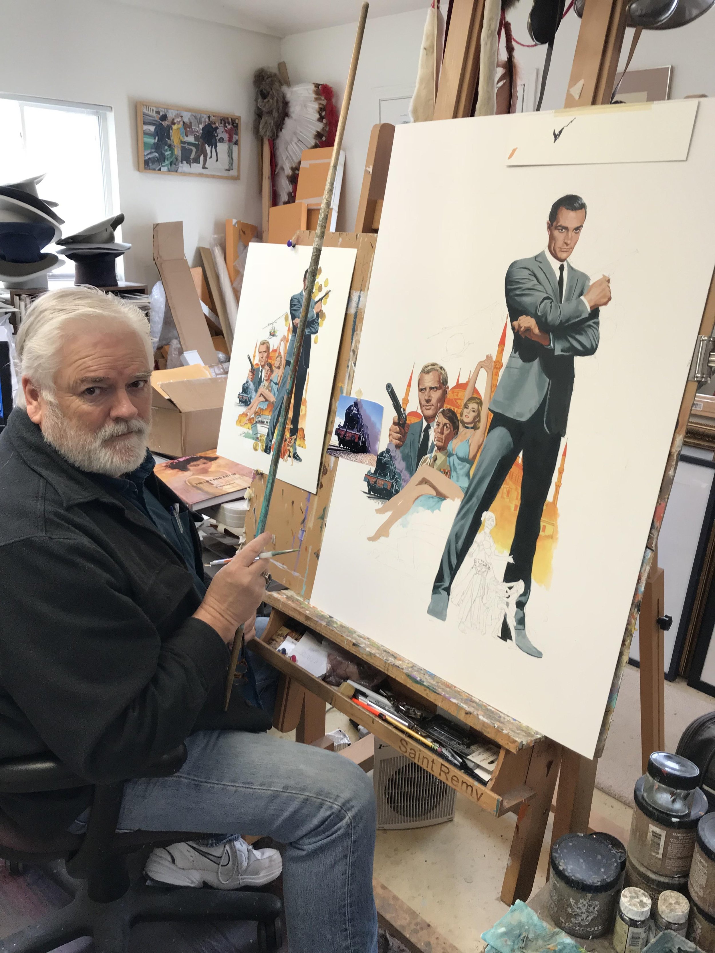
Image Credit: Paul Mann
Layered Butter is a community dedicated to the art inspired by film. Through essays, interviews, and artwork, our mission is to celebrate and champion what we love about the movies. If you like our work, please considering subscribing to our Patreon, purchasing a digital issue, or pre-ordering a physical issue through our store. With your help, we'll be able to grow this community and support the artists and writers who make Layered Butter possible.